Ion Rush Electrolyte Powder
Project Type: Package Label Design (Health Supplement)
client: Fictional
role: Graphic Designer
tools used: Adobe Illustrator, Adobe Photoshop
Description
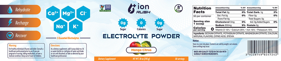
This project was a passion-driven package label design for a fictional health supplement company I call Ion Rush. Inspired by beautifully designed labels I saw on social media, I set out to create a modern, clean, and visually impactful design. My goal was to produce a label that not only communicated the product’s health benefits clearly but also stood out on crowded shelves. The label design features strong hierarchy, vibrant color accents, and a minimalist layout that ensures readability even on the small, hand-sized container. Key elements include iconography for essential electrolytes, non-GMO and gluten-free certifications, and a bold logo mark that captures the essence of energy and revitalization.
Process
The process began with precise planning of the label dimensions to match a beautiful premade mockup I discovered. This step was crucial, as I wanted the design to seamlessly fit the container, similar to how I would approach design for a real client who has specific packaging in mind. I mapped out the layout in Adobe Illustrator, prioritizing a clean, organized structure to make key information instantly accessible. To maximize efficiency, I utilized an online tool to generate the Nutrition Facts section in the standard FDA format. This not only ensured compliance with industry standards but also streamlined the design process—demonstrating my approach of working smart, not hard. I paid careful attention to typographic hierarchy, highlighting important product features like "0g Sugar," "0g Calories," and key electrolytes using a hexagonal icon system. The color palette was intentionally bright and energetic, matching the mango citrus flavor and conveying a sense of freshness and health. I also designed the back panel to be intuitive and easy to read, with sections for "Rehydrate," "Recharge," and "Recover," complemented by matching icons. The final design was tested on mockups to ensure legibility and visual impact at small scales, reflecting my commitment to real-world application and practical design thinking.
Reflection
This project allowed me to experiment with clean, minimalist layouts while still achieving strong shelf presence. I learned the importance of planning dimensions to fit container specifications accurately, as well as leveraging tools like nutrition fact generators to streamline the design process. My focus on clear visual hierarchy ensured the label is both functional and visually engaging, standing out in a competitive market while effectively communicating key product benefits. This project reinforced my belief in blending smart design solutions with practical efficiency.