
Radiant Veil
Makeup Foundation
Project Type: Package Label Design
client: Fictional
role: Graphic Designer
tools used: Adobe Illustrator, Adobe Photoshop
Description
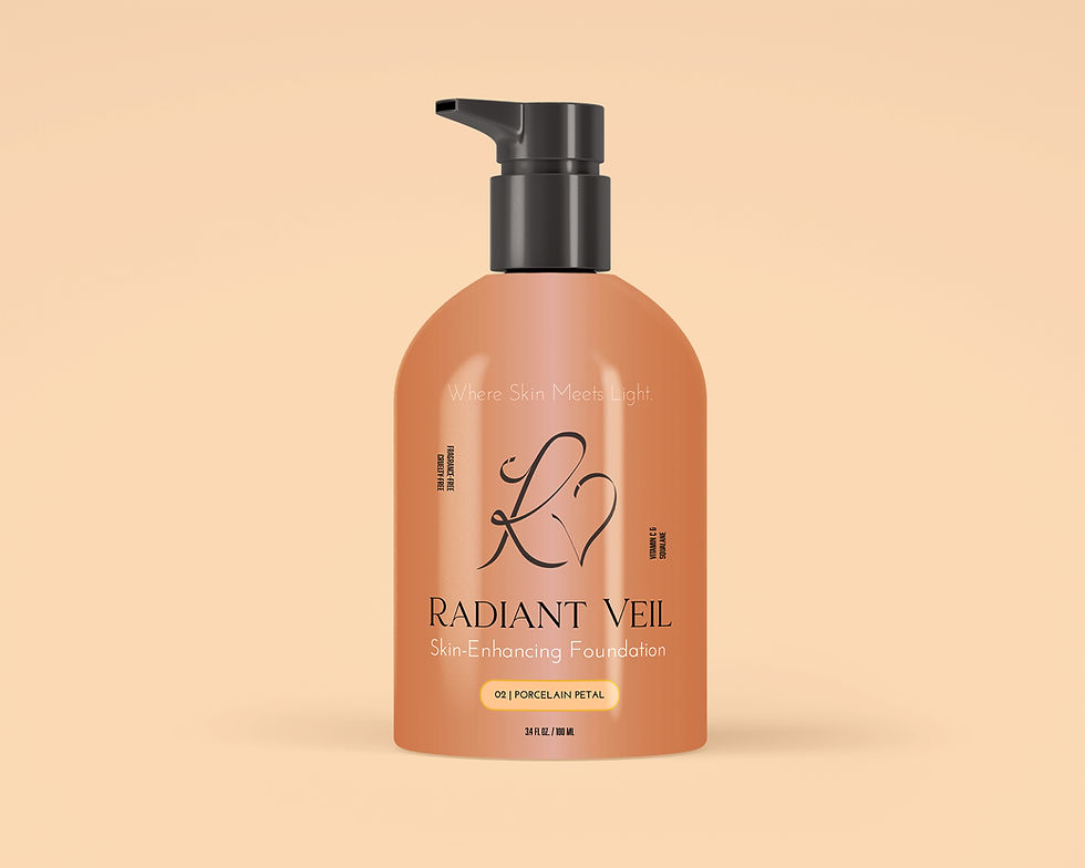
This project involved designing a foundation label for a conceptual ultra-luxury cosmetics brand. Working from a creative brief generated by ChatGPT, the goal was to create packaging that feels sophisticated, pure, and quietly confident—appealing to affluent, style-conscious women who value clean beauty and minimalist design. The product is a hydrating, skin-enhancing liquid foundation housed in a sleek pump bottle, with a formula that is cruelty-free, fragrance-free, and infused with skin-nourishing ingredients like vitamin C and squalane. The packaging needed to communicate trust, modern femininity, and effortless elegance, aligning with high-end beauty standards.
Process
I began by carefully analyzing the brief and creating a word map to connect key themes and design values with potential visual directions. From there, I sourced a high-quality bottle mockup to determine appropriate label dimensions and guide the layout. I used Adobe Illustrator to design the label and referenced luxury brands with a similar tone for inspiration around typography, layout, color palette, and spatial balance. I then developed three distinct versions of the label: one with a script monogram logo, one with an illustrative logo, and one featuring an abstract symbol, each offering a unique interpretation of the brand’s identity. I thought the script monogram met the requirements of the design brief most effectively. The other two options are presented below.
Reflection
This project challenged me to design with both restraint and precision, capturing the essence of luxury without overcomplicating the visual language. Balancing clarity with elegance—especially in such a confined space—reinforced the importance of scale, typography, and subtle detailing. I also gained confidence in using creative briefs as a structured way to guide intentional design decisions. Exploring multiple logo directions allowed me to flex different creative muscles while staying rooted in the same brand narrative. Overall, this project helped sharpen my ability to align aesthetics with brand strategy and audience expectations.


